| Date: 1904
Designer:
Bertram Goodhue and Morris Fuller Benton
Foundry:
ATF
Location:
Chicago, USA
Current equivalent:
ITC Cheltenham
See also:
Cheltenham FB by David Berlow Technologies:
Metal (foundry)
Metal (machine)
Photosetting
Postscript |
| Famous for:
The first type designed for both handsetting and Linotype machines.
Applications: Book Publishing & General Purpose Text Setting
Ubiquity:
Widely used
Category:
20th century Serif Roman
Stress: Vertical
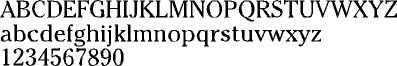
Serifs: Bracketed | | Design history:
'Chelt', as it became known, was the second typeface designed by Bertram Goodhue, and also the first typeface conceived as a large family of related styles – regular, medium, bold, extra condensed, regular and wide. Commissioned and named for the Cheltenham Press in New York City, it was the result of extensive revisions and Goodhue's own theories about legibility, taking three years to complete. Morris Fuller Benton, as head of type design at ATF, personally oversaw the project and made many of the adaptations that translated the original 14-inch working drawings into matrix masters for the resulting twenty four styles of the design. | |  |