|
| ||||||||||||||||||||||||
 | ||||||||||||||||||||||||
 | ||||||||||||||||||||||||
Date: 1962 Designer: Foundry: Location: Current equivalent: See also: Trinité by Bram de Does Technologies: | Famous for: Applications: Book Publishing & General Purpose Text Setting Ubiquity: Category: Stress: Slight angled stress | Design history:
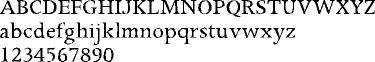
Apollo was the first type designed for the new Monotype photosetting equipment. Designed by Adrian Frutiger, an authority on type designs that were to be made as photographic masters. Unlike metal types, the design of a letterform for photosetting consists of a single size that is then reproduced at a variety of sizes, anticipating later developments with digital CRT typesetting and ultimately, Postscript and Opentype. Like Trinité, also designed for photosetting, Apollo is a workhorse text face of European origin, available in two weights only (regular and semibold) with italics, non-lining numerals and small caps. |
 | |||||||||||||||||||||
profile 86 | ||||||||||||||||||||||||
 | ||||||||||||||||||||||||