Famous for:
Handcut modern blackletter private press typeface.
Applications: Religious and Devotional
Ubiquity:
Very rarely used
Category:
Blackletter Textura
Stress: Vertical
Serifs: Calligraphic
Date: 1930
Designer:
Rudolf Koch
Foundry:
Klingspor
Location:
Offenbach Am Main, Germany
Current equivalent:
Jessica Plus (digitised by Manfred Klein)
See also:
URW Jessen Schrift D, Albertus by Berthold Wolpe
Technologies:
Metal (foundry)
Postscript
Truetype
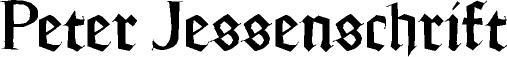
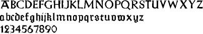
Koch’s Jessen Schrift was intended as a private press typeface for printing religious works, and combined serifed latin capitals with a gothic lowercase. Like his earlier Neuland type, Koch cut the punches directly himself and named the type for Peter Jessen, the director of the Berlin Arts and Crafts Library. Like other attempts to ‘romanise’ the gothic alphabet, Jessen Schrift was short-lived and little known, although it predated other efforts to cover the same ground during the 1930s. This was at the height of a national argument about the rivalry of two competing orthographies in Germany; progressive elements favoured reform of the blackletter types while the nationalists derided these arguments as ‘bolshevik’ and communist-inspired.
profile 69