Date: 1979 Designer:
Bram de Does Foundry:
Enschedé Location:
Haarlem, Holland Current equivalent:
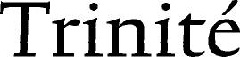
TEFF Trinité
Technologies:
Photosetting
Postscript | | Famous for:
Pioneering hybrid text face design. Applications: Book Publishing & General Purpose Text Setting Ubiquity:
Very rarely used. Category:
20th century Serif Roman family Stress: Angled
Serifs: Modern | | Design history:
Designed as a large interchangeable family of weights and styles, Trinité was a reprise of fellow Dutchman Jan van Krimpen's ideas for a related text family. Made originally for photo setting by Bobst Graphic in Switzerland (later Autologic of California), the typeface comprises of three weights of wide roman, two weights of narrow roman, two weights of small capitals and two weights of italic. The seven weights and widths of the roman and italic also come in three ranges of differing heights for the ascenders and descenders; with expert sets, pi fonts and ornaments, the total family consists of 81 separate digital fonts. Trinité remains exclusive – little-known outside of Holland, but much admired. | |  |