| Date: 1958 Designer:
Adrian Frutiger Foundry:
Deberny and Peignot Location:
Paris, France Current equivalent:
Linotype Univers See also:
BT Zurich
Technologies:
Metal (foundry)
Metal (machine)
Photosetting
Postscript
Opentype | | | Design history:
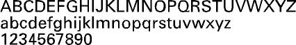
Frutiger analysed the weights of earlier sans serif types such as Futura and Gill Sans, and concluded that they lacked a systematic definition. Univers was planned from its inception as a basic form - Univers 55, the roman medium weight - to provide a series of twenty one weights and styles in a cohesive family. The weight of the type is referenced by the first digit in the numeric type name, so the Univers Light is 4_, the Univers Roman is 5_, while the Univers Bold and Black are 6_ and 7_ respectively. The roman is suffixed in all weights with a 5, the italic with a 6. A critical success on its release, and subsequently popularised by the (Swiss) international style of the 1960s, Univers was the definitive postwar modernist family of sans serif / neo grotesque type. | |  |